Tuesday 13 December 2016

Evaluation feedback

Mark: 7/10
Grade: C+

WWW: You’ve met the requirements of the task and posted a video alongside a very solid evaluation.

The video has real potential despite the obvious flaws. The opening is engaging and throwing the audience straight into the fight works really well. Certain shots such as the POV punch to end it show both creativity and technical expertise. Your evaluation is quite extensive and offers some honest assessment of the strengths and weaknesses. The strongest aspect of the evaluation by some distance is the specific analysis of certain aspects of film language alongside the exact timing from the film (e.g. lighting; sound). You also acknowledge the weaknesses of the production.

EBI: There are still definite areas to improve in both the video and evaluation. In terms of the video, despite the creative potential you haven’t quite met the original brief – and you do break the 180 degree rule once. As you discuss in the evaluation, the audio levels mean it is impossible to follow any kind of narrative. This is not a major issue – it’s exactly why we do the preliminary exercise. But you do need to make sure you learn from this!

For the evaluation, you need to think about structure and planning. For your first paragraph, you spend a lot of time appearing to write about how good your planning was before throwing in a sentence at the very end of the paragraph saying you didn’t put in any effort. It suggests a lack of thought and structure to your ideas.

Still on structure, your next paragraph evaluating the actual production is nearly 800 words – you NEED to organise your ideas and use paragraphs effectively.

Finally, the first half of your evaluation contains far too much description. In an evaluation, don’t describe what shot-reverse-shot is, analyse your use of it and the effect on your audience. You do this much better in the second half when looking at lighting and sound.

LR: Write a list of FIVE things you will do differently for the main coursework and evaluation as a result of your experience of the preliminary exercise and the feedback you have received above.
The five things I will do differently for the main coursework and evaluation are 
  • I will need to communicate well with my group members in order to understand fully about everything
  • As a group, we all need to be organised and plan well before our production
  • For the evaluation, I will need to think about the way I structure my ideas in paragraphs. It is quite misleading to the teachers and myself. 
  • Also, I will need to shorten down the repetition with the same ideas and perhaps think more briefly about the rights and the wrongs. 
  •  Lastly, I will need to think about the organising of my ideas and paragraphs and how i can use them effectively. 

Thursday 8 December 2016

BBFC

1) Research the BBFC: what is the institution responsible for? How is it funded? What link does it have to government?
The BBFC is an independant company in the UK that provide age ratings and classifications to movies before they are released. Moreover, BBFC's main goal is to reward certificates for age ratings to restrict and also, to target the right audience. 
2) Read this BBFC guide to how films are rated. Summarise the process in 50 words.
The way BBFC rate films is that they look at what kind of things is involved within the movie. If there are many violence and inappropriate scenes, it would most likely be 15+ or 18+ which helps to restrict kids that younger than 15 or 18 to watch the movie depending on what the age rating is given by the BBFC company. BBFC want to separate these graphical content away from the children so that they don't get influenced. 

3) Read this BBFC outline of the issues faced when classifying a film. Summarise the debate in 50 words.
BBFC firstly think about whether the content that they are about to rate and classify is suitable for certain ages. Also, with some graphical content, they think that the unintended viewers will be influenced and harmed by what is shown. This is down to the events and actions that are shown in the plot of the movie.
4) Read this BBFC section on controversial decisions. Why did The Dark Knight generate a large amount of media coverage regarding its certificate? Do you agree with the 12A certificate The Dark Knight was  awarded?
The independant company "BBFC" sometimes give particular age ratings to a movie which some people will argue that the movie doesn't meet that particular age rating. For example, the movie "Dark Knight" which is about Batman, it was rated 12A even though it included many horrific, graphical and innappropriate scenes which shouldn't be allowed to be seen by kids that are 12 or 15 younger. I think the generic problem was that the movie was rated the wrong age rating and this led to the moie generating a large amount of media coverage as younger kids younger than 15 were allowed to go to the cinema and watch the film. It had a wider audience involving kids at the age of 12 or older. Moreover, I don't quite agree with the 12A certificate as I thought it involved many scenes that included weapons, blood and strong language. 

5) What are the guidelines for a 15 certificate?
When classing a film, there are many things that have to be visualised in order to rate a film 15. 

Language: For 15 age rating, there could be little scenes with minor heavy language but with strong language in many scenes could be forbidden.  

Sexual Content - Nudity :  Sexual content or nudity of both gender may be accepted for few terms such as education but however, the key parts of the body must not be shown within the camera frame. 

Violence: Violence are accepted but however, violence that leads to a huge amount of blood or brutality could be prohibited. Also, violence that include sexual acts are also prohibited. 

Drugs: It is important to not clarify much details about certain drugs that they use within the movie. But however, it is allowed. 

Threat: Threat could be allowed but it depends on what kind of threat and how much it goes over the top. Movies that are 15 must not show rape in action as it is a huge problem in the society and showing this in the film could negatively influence more. 

6) The BBFC website offers an explanation of every classification it makes and detailed case studies on selected titles. Choose one 15-rated film from the BBFC case studies section and summarise the classification the film was given and why. 
For a 15 rated film, I have chosen to talk about Deadpool. With the classification, the movie was rated 15 due to the actions and events that took place within the narrative of the movie. Firstly, within the movie, it did contain strong language but it didn't reach up to an extent amount where the movie wouldn't be classified as a 15 rated movie. Also, with the innapropriate content such as Sex, it was shown but the bodies were detailed espeically the key parts that are not meant to be shown. Moreover, with violence, there was horrific moments where blood was shown and many fights occured but no threats such as rape or any other harmful thing to the audience was shown. Lastly, there was no discrimination towards any other people or races.

Monday 5 December 2016

Existing Product Research

It follows
This is a frightening scene with a mixture of fast-paced and slow-paced editing which makes the scene more elegant linking with the genre of the movie which is horror. This movie is a supernatural psychological horror film that was released in 2014. It was directed and written by David Robert Mitchell. Firstly, starting off with the non-diegetic sound within the scene, I can clarify that the non-diegetic sound certainly makes the atmosphere with the audience more intense as it is almost a heavy, deep bass sound that builds up as the ghost-like person appears from the beginning of the scene. With more brief, the beginning of the scene, we see the characters sitting down and the non-diegetic was then more silent. Then we eventually see the main character's hair being stood up out of nowhere. When this happened, the non-diegetic became deeper and louder, indicating how the following part of the scene is going to be intense within the audience and dangerous for the characters. Furthermore, moving onto 2:13 of the video, we see the sudden pop up of the kid that is supposedly the ghost. When the kid appeared through the hole of the door, the non-diegetic appeared once again and it was more louder. It makes the entrance of the ghost more dramatic and it makes the ghost look extremely dangerous. Moreover, the non-diegetic within the whole scene is parallel to the scene which makes it more understandable and better for the audience. 
Additionally, with the setting of the scene, it is on a isolated and solitary beach which lays somewhere in North America. The idea that the scene takes place in a solitary beach is that it's quite unusual to see a horror event taking place out in the public. Mainly, in horror films, we see horror events taking place inside the home of the people. In addition, the props within the scene are the gun and the car. The gun is there for her protection from the terrifying ghost. And the car is there for her to escape from the ghost. Additionally, there were variety of different shots within the scene to make it more significant. For example, from 2:38, there is a wide shot from inside the car, showing the character running away from the ghost, towards the car. The fact that this camera is placed inside the car makes us as an audience think suspicion of someone else being in that car too. It builds up intensity and anxiety. 

With the age rating, I think this movie scene indicates that this movie is a 15+ movie, mainly being targeted at younger adults and teenagers. The age would vary from 15 to 30 perhaps. I think this would appeal to younger adults and teenagers because the actors are all young too so the audience could relate to the problems and them having suspicion of danger with them in real life. Moreover, there are alot of sex involved in this movie which makes it more understandable on why younger adults and teenagers would be appealed by this movie. Elderly people are more mature and wouldn't want to coporate with any movies that include sex. However, with the target audience, I think they would be appealed by the innapropriate content in this movie and therefore, they are the target audience of this movie. Moreover, I think that male are likely to watch this movie more than female with the percentage of 55% for the male and 45% for the female. This is because it includes a male character that started all this curse on the main character. 


Girlhood
This scene is from the movie "Girlhood". The movie is about a girl called "Marieme" and how she joins a gang and her attitude and behaviour starts to change. This movie falls into the drama category and was released in 2014. Within this scene, we hear the girls speaking a foreign language which was french. Within this scene, we see that Marieme learns how to dance from her bad influential friends that influence her pessimistically. Firstly, in the beginning of the scene, we are immediately shown a close up shot of her friend. This close up shot allows us to see her facial expressions and the way she disrespects the public. It allows us as an audience to look at how spoilt she is with her movements in the Subway in front of everyone. With the sound within the movie scene, I don't think there was any non-diegetic sound as there weren't any dramatic scenes. However, there were diegetic sounds. The first one was the music that the group of girls were dancing to. Secondly, the language the girls are speaking. Thirdly, the very low sound of the train moving. In addition, within the whole scene, the camera seemed steady and not hesitant as it kept moving to different characters without any shaking. Lastly, the actors throughout the whole video remain full of energy and active on the subway as they are thoroughly dancing and forcing Marieme to dance too.

The age rating of this movie "Girlhood" was 15+ due to the strong language, violence and a lot of scenes showing drug use with the characters. With the age variation, I think it would vary from 15 to 30 again due to the following reasons. This movie is written and directed to reflect on real life events that take place with people being misled by wrong friends and suddenly they start to change themselves. These problems are mainly constant within many teenagers and young adults that follow the wrong footsteps and then are completely changed by their friends into a misbehaving person. Moreover, I think this age would be suitable for this movie as this is a coming of age films therefore it is more suitable to people aged from 15 to 30. Lastly, I think the percentage of gender to be appealed by this film would be 55% female and 45% male. I think this is the case because within the movie, we have the main characters that are female so more females can relate with the female characters and the issues that they are facing.

Donnie Darko
For my third research, I have chosen to analyse the movie scene from "Donnie Darko". This movie falls into the drama, Sci-Fi and Thriller genre category. Also, this movie was directed and written by Richard Kelly and was released in 2001. Moving on, within the scene, we see a male character speaking to a female character about his mental state and he tells her about his experience when he was young with a girl that told him that time travel exists. Moreover, as we as an audience immediately knew the setting of the scene which seems to be in a house of his own perhaps. Also, the clothing of the two individuals are a complete contrast. The male character Donnie is wearing casual clothes whereas the female character that is interrogating Donnie is wearing smart clothes, which makes her look more professional. Moreover, within the whole scene, we don't have a non-diegetic sound. The atmosphere within the scene seems to be dull and dead as it is a slow-paced scene with no dramatic non-diegetic sounds or any other diegetic sounds. Additionally, the lighting within the scene is more low-key than high-key as no lighting is used. The natural sunlight is used but is covered by the blinds to make the scene more artificial and significant. Also, the editing within the scene is very slow making it dull for the audience. Lastly, the props within the scene is the book that the female character is using to write down what Donnie says.

The age rating of the movie "Donnie Darko" was a 15+ which makes it understandable as not much inappropriate scenes are shown but there are still strong language and psychological horror being included in the movie. The age of what this movie would appeal to would most likely be from 15 to 35 because I think you would have to be a little older to understand the mental issues of the character "Donnie". Also, with the main character being male and the whole narrative being based around him makes it more appealing to the males as they would see something relatable. Lastly, with the percentage of the gender, I think male is 60% and female is 40% due to the genre of the movie. The genre of the movie is Science fiction with thriller and drama which mainly males are appealed by. They want to see violence within the movie so that it can entertain them.

Boyz N the Hood
For my fourth existing product research, I have decided to analyse Boyz n the hood. Boyz n the hood is drama and a coming of age movie that was directed by John Singleton and released in 1991. A movie like Boyz n the hood is one of the most elegant and artificial movies due to the creative narrative and the layout of the movie. Within this scene from Boyz n the hood, it shows a burglary been taken in place where a thief invades the house in a stealth mode. Moreover, when the scene began, I could immediately hear the contrapuntal non-diegetic that did not fit in with the scene. In the scene, we see a thief in the house and a trumpet like non-diegetic sound is used which makes it more hilarious for the thief as it helps us to realise that the thief is going to flee or get caught due to the sound. Moreover, at 0:25, we hear the non-diegetic sound louden up as the dad gets his gun ready. The sound getting louder as the gun is being prepared just shows the slow build up and the intenisty within the scene as well as the heated atmosphere. Additionally, moving onto the diegetic sound, at 0:05, we hear the water drops starting to occur which helps us as an audience to understand the upcoming danger within the scene. Furthermore, the lighting within the scene is certainly more low-key lighting than high key which links up with the whats happening within the scene. The lighting is artificial and makes the scene look more terrifying. Moving on, the props within the scene is we see a gun which the father has. The gun is used for himself and his son's protection from the thief. Also, the setting seems to be a house of the father's.

The age rating for this movie is 15+ which totally makes sense as the movie contains strong language, censored scenes and violence. The age variation of this movie would be 15 to 30 as in those ages, many people face the problem that is shown in this movie. Also, the movie includes many young males which helps it to understand that this movie would appeal to that range of age. Lastly, the male would be 70% and the female would be 30% due to the problems shown in the movie which many men can relate with, not females. More males face the problems shown in the movie than females.


United 93
This is a film clip from the movie "United 93" which was based on the 9/11 terrorist attack that took place on the September 11 2001 when the 4 planes were hijacked and driven into other buildings such as the Twin towers that were completely destroyed. The setting is within the plane which is the flight 93 which was the number of the flight in the real event. Within the clip, it shows people fighting back the hijackers so that they can survive. Within the clip, there are many medium and close up shots which help us as an audience to see the character's facial expression during the event taking place. Moreover, with the camera, the camera is always shaking and not steady which is trying to make the event look realistic which reinforces it as the event was real. Furthermore, there is a non-diegetic sound which plays as the background music and it is almost like a depressing sound which is completely parallel to whats happening within the scene. Also, it makes the scene look more dramatic with the way it is. Also, the actor placement is known to be played as the people who actually died in the airplane crash.

I think with the age variation, it would appeal to people that are aged from 20 to 60 as it has many scenes containing graphical and disheartening moments. Also, it is a hysterical event that actually took place and elderly people are known to be more appealed to history. Also, the elderly people are bound to be more epathatic with the people that died due to this horrific terrorist attack. Lastly, I think the gender would be 55% male and 50%female as male are tend to handle these disheartening true events that took place and the innocent lives that were taken away.

Tuesday 29 November 2016

Evaluation of Preliminary video

Evaluation

For this task, I will be evaluating my group's preliminary exercise video that we assembled as a 4 to create this short 1-minute video. Within my group, it was me, Emman, Ellis and Harvey.

Firstly, starting off with our planning process, I think our planning process was the reason why we as a group filmed our 1-minute preliminary exercise within 1 hour. Within our planning process, we as a group had to do the script of the video, storyboard of the video and the shot list for the video. Each individual would do each one so that the planning process would be quicker and it was. Moreover, beginning with our script that we created for our short video. Making the script before shooting the video was a huge benefit to us. It was beneficial to us because it allowed us to know what kind of video we are going to shoot. Also, it helps us acknowledge our own lines as actors within the video. Within our script, we made sure that we finished the whole script before shooting because then the actors would know what to say and also, we as a production group would know what type of genre or what the narrative it is and it helps us to think about more ideas to make it more interesting while shooting the video. Additionally, moving onto the storyboard of our preliminary exercise video. We as a group had to make sure that one of the individuals did the storyboard so later on while shooting the video, it will help us know how to layout the video. For example, we would know how to create the narrative a little more dramatic. Also, the storyboard was a giveaway of the genre which helped us to know what aspects of film language to include so that it can be more dramatic and significant. Furthermore, with our shot list, it was a huge benefit to us to plan because it helped us, later, on to know what to do immediately with the Shot list, Storyboard and the script. With our shot list, it included all the shot types such as what angle or shot type such as Close up shot we were going to use for our preliminary exercise video. While shooting, the shot list certainly gave us a huge insight of what to do and how the video was going to turn out. Also, it helped us to know what shot type to shoot after each one as in the shot list, they are all ordered from the start to the end. In addition, we as a group would definitely put more effort into planning because we didn't put much effort nor brief into our planning. And due to this, our final production wasn't as satisfying and didn't turn out how we expected to turn out.

Our preliminary exercise video certainly did contain strengths as well as weaknesses but in this paragraph, I will be evaluating my video positively so I will look at the strengths of our video. Firstly, with the preliminary exercise video, we had to add in match-on-action shot, shot/reverse shot and 180-degree rule shot. These 3 shots had to be included within the video somewhere and we did add all the 3 vital and needed shots. With the match-on-action shot, we placed it at 0:12 seconds of the video where from one shot, it showed the actor kicking the door and it eventually moved to another shot where the scene continued. This match-on-action shot was a crucial shot as it made our preliminary exercise video look more professional and significant. Moreover, with the shot/reverse shot, we used that at 0:24 where the shot starts. A shot/reverse shot is when the camera is placed behind a subject's head, almost like over the shoulder shot and then after, the camera moves behind the another subject. This shot was an appealing shot type as it made our video more elegant with more shots rather than having one dull shot where it catches every action. Furthermore, with the 180-degree shot, we used that at 0:24 seconds as well. A 180-degree rule is a similar shot type to shot/reverse shot. Moving on, another strength of our video was that the focus on each subject made it better as when one subject was speaking, the focus was on that subject. Moreover, as the video began, the pace of the video was immediately fast which suited the action going on within the video. It makes it more dramatic; almost trying to make it realistic by making it the same pace as the action. Lastly, the lighting within the video certainly did suit the genre and the narrative of the video and it made it look more intriguing as it linked with the brutal narrative which involves abuse and inappropriate words. An example of a good lighting would be that at 0:26 seconds of the video, we are introduced to a "Master-like" character that speaks to the abducted character calmly and confidently. According to the narrative, that character was a spy-like character and the lighting to make him not visible at 0:26 seconds, it makes him look dangerous and more better as the role of a Spy-Like character. We know that Spy-like characters are mysterious and deadly so we as a group thought of an idea to make the character less visible with the low-key lighting so it can make more sense to the audience of who he is and how dangerous he is. Our preliminary exercise video certainly did turn out to contain weaknesses that we as a group need to reflect on. Not just our preliminary exercise video that contained weaknesses but it was also our lack of communication between each other within our group. Firstly, starting off with the weaknesses within our preliminary exercise video, the first thing that we acknowledged something wrong was that the non-diegetic sound that we added when editing to make it more dramatic, came out to be extremely loud which made it harder for the audience to understand the dialogue. The sound certainly did distract the audience from watching the clip. The audience were rather more worried that they were able to hear the non-diegetic sound but not the dialogue and the dialogue is the main part of the understanding of the audience. With the dialogues, they are the biggest thing to how the audience understand the movie and the narrative of it and for that to be taken over by a dramatic sound, it really destroyed our video and the expectations that we had of the video. Furthermore, another weakness was that the camera movement was always too dramatic even when the actors were placed on the table, the camera was moving quite heavily and it frustrated us and the audience as they weren't able to see the actors properly as the camera kept on moving and the actors were sometimes disappearing from the camera frame. Moving onto the weaknesses of the teamwork within our group. We as a group certainly didn't communicate well with each other. This is because we all as individuals started to edit our own exercise video on the Adobe Premiere even though we weren't supposed to. Also because we didn't know who was doing the editing so we kind of drifted our own ways. This is something that we should certainly reflect on as this mistake is really common when working within a group. Lack of communication brings pessimistic side into it later on and that is what happened; our video didn't end up how we expected it to turn out. 


Thursday 3 November 2016

Editing Task

The Kingsman

This amazing brutal fight scene is from the movie "The Kingsman" which shows the donor brutally defeating the villains in the typical British pub. In the beginning, where it was calm and peace, the editing was much slower which goes with the peaceful harmony. But however, when the fight occurred, the increase of pace in the editing was a real huge difference to how it was before the fight. The editing that was extremely paradoxical to before the fight and during the fight immediately signifies the change of atmosphere and mood within the scene. The fast paced editing during the fight signifies how dangerous the character is. Moreover, with the fast paced editing, it also immediately creates tension within the audience making them feel full of anxiety. The fast paced editing almost makes the whole scene look better as it has a huge synergy with the fight in the scene. Within the fight scene, there were a huge amount of straight cuts used and straight cuts are the most common editing and these cuts are rarely recognized by the audience. These straight cuts is what makes the editing fast and makes the fight scene look significantly amazing. It certainly does make the fight more dramatic. As stated previously, the fast paced editing has a synergy with the actions within the fight scene as the character is brutally beating up the other villains so quickly. Additionally, we also see a rare slow paced editing during the fight when the donor fires the gripper at the villain, as it was fired, we see a slow motion, close up shot of the gripper making it look more amazing and distinctive. In addition, in the beginning of the scene, between the donor and the potential protagonist, while their conversation was running, there were many over the shoulder shots from both characters making it consistent. Additionally, before the start of the fight, there is a close up shot of the kingsman character shutting the door. The fact that the camera framing changed to a close up suggests how dangerous he is and how brutal it is going to be for the opponents. It also shows that there is no way out for the opponents. Moreover, 2:40, it was almost like it was a point of view shot from one of the members in the gang which makes it seem more realistic. Also, while they were walking up to the Kingsmen character, the character is faced away from the camera and the attackers which signifies something mysterious and danger prior to the fight. After, as he turns around, there is a medium shot of him talking and this shot helps us to clearly see his facial expression and he is certainly calm prior to the fight. As soon as the fight ended, the fast editing deteriorated back into slow pace editing.

Moreover, the sound during the fight within the scene was a very dramatic and fast paced background music. This fast paced music sounded similar to a victorious sound signifying how the character has already won the fight before even winning it. Also, the sound makes the fight more enthusiastic and dramatic. Additionally, its also sort of a tension build up sound towards the end when he blocks the bullets with his umbrella. The sound then was a anxiety build up sound that probably made the audience nervous about the ending.

Within the movie scene, I acknowledged that the lighting was very high key and this is a little abnormal to see a high key lighting during a fight scene. Perhaps, the high key lighting is created to make it more of a realistic fight between the man and the gang.

Moreover, moving onto the mise-en-scene. The character's neat suit makes him look professional and neat but in  a fighting sense, it makes him look really intelligent and really dangerous almost similar to the mafias. The director's thinking of the costume is that he wants the character to probably look like a hitman that is really dangerous and is a good person.

Thursday 27 October 2016

Cinematography analysis

Mise-en-Scene
At very first of the scene from Batman vs Superman movie, I can immediately spot out the dark armoured metal costume that Batman is wearing and this gives a indication to the audience that Batman is an extremely dangerous man with potentials of high danger to many. Moreover, it also suggests that Batman is ready to fight someone due to his masculine walk and the weapon that he is carrying which is the kryptonian weapon used only to kill Superman. So from the costume Batman is wearing, we know that the strength of the opponent and is highly threatened by that hence the reason for his huge armoured costume that is worn to cause less damage to him. Moreover, as the scene resumes to the scene where Superman meets Batman, the lighting on Superman is very low-key as we as audiences cannot see him properly meaning that the director is trying convince the audience that Superman is very dangerous and this fight ahead is going to be a huge fight. Also, the lighting on Batman is also a low key lighting immediately making him look more masculine with his dark huge costume. We also learnt that the two superhero actors do not fit into the world where there are many normal citizens so the two are different from the world. In addition, the props used in this movie scene are the weapons that Batman hid in order to injure Superman. As learnt through the costume of Batman and the dramatic entrance of Superman, we know that Batman needs weapons and other things to help him defeat Superman. Lastly, the setting of the fight scene seems to be in a destructive, isolated and dark city which seems to be extremely abandoned. This is the perfect setting for the fight to occur as it will simply make the fight between them two more spectacular and dramatic.

Sound
Furthermore, the sound within this fight scene between Batman and Superman is more non-diegetic meaning that it was later on added on the editing software. For example, when Batman and Superman were physically punching each other on top of the building, the almost crescendo like dramatic non - diegetic sound came in making the fight more dramatic and this will immediately create intensity within the audience. It will create anxiety around the audiences as the fight will be more intense. Moreover, the thunder non - diegetic sound also immediately made the fight more sensational and it put more enthusiasm into the fight in order to indicate to the audience that this fight is more than a fight. Additionally, also in that physical punching fight, the dramatic non diegetic sound is parallel to the scene as it is a heavy bass sound which is mostly used in fight scenes to suit the scene.

Cinematography
Within this fight scene of batman vs superman, there were huge amounts of camera framing and camera movement.Firstly, the close up shot of Batman's face with high angle shot is forcing the audience to understand and know the facial expressions of Batman prior to the fight. Secondly, there is a magnificent low angle shot of Batman where he is standing up looking up to the sky. The low angle shot immediately indicates to the audience that Batman is going to e lethal and clinical in the fight. In addition, when the scene continues to 1:18, the camera placement is behind the woman character suggesting there is someone behind her perhaps. Moreover, the camera isn't steady and still which shows realism within the scenario. Additionally, when it reaches to 1:31, there is a over the shoulder low angle shot from behind Batman showing Batman looking up to Superman which helps the audience to know the most dominant one in the fight. Then after over the shoulder shot from Batman, it moves onto over the shoulder shot from Superman looking down at Batman immediately indicating to the audience that Superman is the more lethal and dominant one. It is vital to understand these low angle and high angle shots as they indicate huge things to the audience and gives hints for the upcoming narrative. For camera movement, there is a crane shot at 3:14 where we see Superman carry Batman and almost lashing him down to the roof of the building. A crane shot is when the camera is placed a good distance above the ground (the camera is placed on the crane). A crane shot is used to help the audience have a better view of the fight scene. Moreover, at 0:40, a tilt movement is shown when the camera is steadily slowly moving upwards on its axis to show the symbol of Batman. It helps the audience to almost realize Batman's danger and his masculinity.

Editing
From the video, i can clarify that there are mostly straight cuts from each scene to another scene. Straight cuts are used to fasten the scene up so the scene won't stay in the same scene for a long time which will make it dull for the audience. 


Monday 10 October 2016

Reflecting on LR

Post this in a new blogpost on your MEST2 Coursework blog and complete the LR tasks/questions below.

WWW: There is some really impressive work on your blog already – well done! I really enjoyed reading your posts so far and there’s a lot to give credit for: consistent use of media language, clear engagement with the texts and also it’s great to see understanding and application of what we’ve learned in the film language unit so far. This is a very positive start to the course.

EBI: There are still many aspects we need to work on and you do have a few bits missing or incomplete that we need to keep an eye on. The workload in AS Media is significant and it’s vital you stay on top of it – as long as you’re putting in the five hours or work outside of lessons you’ll be fine. The incomplete work: lighting – Film Noir research is extremely short and doesn’t include a clip with accompanying analysis; Sound LR – you haven’t discussed who you thought produced the top three sound videos and why.

In terms of the work you have posted, you are picking out some interesting details but overall you will need significantly more depth to your analysis in order to reach the higher grades in AS Media. Be very careful that you are not simply describing scenes or still images rather than analysing them – it’s crucial you go way beyond denotation and discuss the impact the media language choices have on the audience. Similarly, think carefully about film genre – often you are accurate but when you’re not sure you seem to fall back on action. Look at the Uzak poster again – is there anything on there that really suggests action? You need to be careful here. Written English is another area to look at - you need to communicating accurately at all times (you’ve confused there/their in a couple of places). The other aspect of written English is paragraphing – in some of your more extended blogposts you write in one huge paragraph (e.g. Batman v Superman still image analysis). This makes it very difficult to follow your points and also judge whether you are examining each individual aspect of the text in sufficient detail. Overall, a good start but still plenty for us to work on over the next few months!

LR: Firstly, make sure you catch up with the missing work by the end of this week. Then, for your LR, reflect on your first month of Film Language. What is your strongest piece of work so far? What is your weakest? What specific skills or knowledge do you need to develop over the rest of the course?

LR Response

Reflecting on the first month of film language, i think i did quite well with catching up with the work and knowing media language. With all my works that i published to my blog, i think the amount of it was huge meaning that i went in depth with my explanation in some of my work. However, i could have went in more depth and explained certain things more briefly and using more media language. I could have also done most of my works on time and not publish works later than the due date. 

In the first month of Film Language, i think my strongest piece of work was the analysis i had to do for the lighting for each film posters. I think i explained in depth about the lighting for each posters. 

I think my weakest piece of work was probably the film Noir work where i had to research film noir and write down information about it. The reason why i think it was the weakest is because it was too short and it lacked brief analysis so I will need to find more information and to analyse better. 

The specific skills i need to develop over the rest of the course is to use more media terminology and to link everything with media language. This is important as i will need to explain everything including media language to make it understanding. I will need to be more in depth with my analysis meaning that i will need to evaluate my analysis and explain more. 

Friday 7 October 2016

Clockwork Orange Sound analysis

Image result for clockwork orange
Clockwork Orange

1. I think the choice of music was completely contrapuntal to the extract from Clockwork Orange when the violence started to occur within the characters. Even from the start, it didn't match the extract as the choice of music is instrumental and extremely classic. For the music being extremely classic, it didn't match the extract for the following reasons; the video looked more new and the classic song sounded extremely professional and it looks like its a music for high classed people and the characters did not look high class at all due to their costume and the setting. The characters were wearing hilarious costumes to make themselves look weird and abnormal. Additionally, the music was a non-diegetic sound meaning that the sound was later added on the editing software to make the sound contrapuntal to the video. Also, the meaning o fit is that the audience are only able to hear the music whereas the character within the video are not able to hear it. Moreover, sound bridges are sounds that continue even when the visual image has moved to the next scene. Within the video, we did have a sound bridge where the sound was consistent throughout the whole video and while it was playing, the videos kept moving to one scene onto another. Furthermore, there was voice overs added on. The voice-over is a definite non-diegetic sound meaning that the voice over was slotted in with the video on the editing software. If it was a diegetic sound, we would see the character speaking. Moreover, as the characters turned violent, the volume of the non diegetic music immediately went higher to make it more enthusiastic even though the music was contrapuntal to the video.

Friday 30 September 2016

Sound video Learner Response

  • Fantastic choice of music - so evocative and a huge part of film history
  • Images and videos for parallel  superbly - very nicely edited too with good pace and transitions. Combination of videos , gifs and still images are combined well - not easy to do.
  • titles take something away from the video- trust your audience! If you need to use a title (and you really did it here) then the images and music aren't clear enough. 
  • Parallel stronger than contrapuntal... Horror stronger than action , the contrapuntal side. 

My own Learner Response

WWW:
  • I think I used the right amount of images, video and GIF's within my video. 
  • My music was completely parallel to the videos at first in the parallel part. 
  • The horror scene was an excellent contrapuntal GIF to the song.
EBI:
  • I don't think i should have included the headings as it forces the reader to understand that i am trying to force them to understand that it's parallel and contrapuntal.
  • I think I could have used another video that is more contrapuntal to the sound.
  • I also think i should have used more contrapuntal images to make it more contrapuntal to the music. 

My top 3

The first person's video i would like to evaluate and compare my video against is Ellis Hayes's. I think this Parallel and contrapuntal video was on of the best as the music that he picked was extremely parallel and contrapuntal to the videos used for both section. The song was perhaps quite relaxing and peaceful which was a significant synergy with the parallel images. It was great how his thinking about music was unique to other people's music. Additionally, compared to my video, i think i could have used a better contrapuntal video at the end where i showed the superheroes fighting against the villain. Even though the setting was destructive and it was violent, i think i could have used a more extreme and brutal video than the video i used. 

The second person's video i would like to evaluate and compare my video against is Sophie Carys's. Why I think this video is one of the best in the class? I thought that this video was one of the best in the class as the music was parallel to the video used for the parallel section. I think it went really well with the video as the music was a self - comfort music where they said "i feel pretty" which also contributes with the parallel video which shows a girl doing her makeup and being all comfortable about her looks. In comparison to my video, i think i shouldn't have put up the headings "parallel" and contrapuntal". This just sends a message to the audience that they won't know if it's parallel or not. It also shows how i am trying to force the audience to know that it is parallel and contrapuntal. So what i could have done better is that i could have not added the headings.

The third person's video i would like to evaluate and compare my video against is Carol's video. I certainly did like Carol's video of Parallel and contrapuntal music. I liked his video because the music was a classic music that would mostly be heard by higher class people. It was a peaceful and a dancing song which went well with the parallel video where it showed a couple dancing wearing formal dress making them look high class. Additionally, the contrapuntal video was also phenomenal as it was extremely paradoxical with the peaceful music. It showed Hulk smashing down a man on the ground several times which was extremely brutal and didn't match the music at all. With comparison to his video from mine, i think i should have added more brutal and horror images for contrapuntal to make it more contrapuntal instead of using Gifs of a man holding a gun because there is no violence in that.  

Thursday 29 September 2016

Film Noir 


  • Film Noir is a genre 
  • A genre including mainly mystery and crime dramas.
  • Also including pessimism and fatalism throughout the movie. 
  • Film Noir movies were starting get produced from the early 1940s to late 1950s.
  • Film Noir famous directors: Orson Welles, Fritz Lang and Billy Wilder. 
My video

Parallel vs Contrapuntal

Wednesday 28 September 2016


Task 1

1. Although this picture may have low-key lighting but in my perspective, it has more high key lighting. An example is that we can see her whole face clearly even though one part is litter than the other.

2. The lighting is surely back lighting as we see side of the face is litter than the other.

3. With back lighting, it creates a sense that the character on the image could be a femme fatale character due the low-key lighting in the other part of the face showing mysterious and dangerous character who could be seductive. Moreover, there is a smoke from her cigarette and the smoke is clearly visible indicating her dangerous behaviour. Her holding a cigarette as well as her facial expression is an indication also that she could be a femme fatale.

1. This poster is definitely low-key lighting as it is more darker than litter. The lighting makes the movie's genre look as if its a horror movie due to the an extreme low key lighting making the character look glamorous as the there is top lighting.

2. There is only lighting from the top which makes the character look glamorous.

3. The lighting certainly shows that this movie fits into the horror genre with low-key lighting everywhere except from right corner and character's face. As stated before, the character looks glamorous but this genre could also be film noir as the woman is holding a cigarette which is abnormal to see in a horror movie poster. This could suggest how her characteristics is like femme fatale.


1. This poster is definitely mostly high key lighting as the genre could look like it is a drama movie.

2. The lighting used for this movie poster are definitely filler lighting, back lighting and key lighting as it is lit everywhere within the poster.

3. The effect that these lighting make is that it makes the movie look as if it falls into the drama criteria. Moreover, it looks like a historical drama type and the fact that the all the lighting are used makes the movie poster realistic to show historical events. As we know, historical events actuallt did happen so it must be shot realistically.

1. This is a definite low key lighting which the genre could be an action genre. There is more darker colours than lit colours.

2. The lighting used for this is a definite top lighting as well as back lighting as we can see his face light up a little.

3. The lighting makes the character look like a spy detective dangerous character with iconography of gun in his hand. Moreover, the fact one side of his face is litter than the other emphasises how mysterious this character is. It supports the idea that he might be a detective.

1. Even though it has a little of low key lighting but the high key lighting is more visible as we can see more light.

2. For this image, there was a definite filler lighting and key lighting to create a realism within the image.

3. The effect that these lighting have is that we see her facial expression which she seems to be terrified of a murderer perhaps. There is a shadow to create a sense of danger coming to her. With the lighting of this image, i am convinced that this movie could be about horror but the lighting doesn't support it so it must be thriller or action.


1. This could be a little more high key lighting than low key lighting as we can a natural lighting hit the two characters through the curtain.

2. The lighting used for this image is a sun light through the curtains as it makes the scene look more realistic. It shows both of their face clearly.

3. The lighting certainly makes the image look as if the movie genre could be romance with the high key lighting mostly everywhere on the image. Its a image of a couple kissing immediately indicating that the movie is a romantic movie.

1. This is more low key lighting than high key lighting as we are not able to see the faces of the characters. There are lots of shadows shown too.

2. The lighting used for this image is a definite back lighting as we can see like a sun light perhaps coming underground to lighten the background up.

3. The back lighting surely does make the characters mysterious as we as consumers are not able to visualise what they look like. The back lighting also creates a silhouette. They seem to be having a weapon on their hand which is a iconography of action elements. So this movie genre could be an action or a thriller through the lighting from the back making the characters look mysterious and threatening.

1. This movie image seems to have low key lighting and high key lighting. The character's face is extremely lit but one side of the face is less lit due to the lighting used to create this shadowy and lit image. 

2. In my perspective, the lighting used for this movie image is a filler light coming from the side and front. This is apparent as one side of the characters face is litter than the other. Moreover, her shadow can be seen on the wall also supporting the idea that the only lighting used for this is a filler lighting. 

3. The effect that this lighting has is that it creates a shadow of the woman on the wall which is makes the image more darker which could be suggesting that the genre of this movie could be horror due to dark colour tones in this image. Moreover, behind the woman is also a really low key lighting to suggest something ferocious is going to happen to the character. The lighting is used to light up the characters face so that her facial expression is visible to the consumers. Her facial expression helps me to know that she is frightened of something which may be a demon or a murderer. 


1. In this image, it is a definite high key lighting as the background is clearly lit up and the character is also clearly lit up.

2. The lighting used for this image are probably a filler lighting from the top and from the right side as the left side of her face and neck is less lit than the right side.

3. The high key lighting makes this image look realistic. Moreover, i could signify that the genre of this movie could be drama due to the realism of the image due to the lighting.
1. In this image, it is extremely dark suggesting that the lighting is a low key lighting forcing the consumers to think whether its a horror genre or action genre.

2. The lighting seems to be coming through a curtain type as i can see the light on the wall. Not enough lighting is used to create a lit area.

3. This shows how the character in the movie is in danger and is probably in an haunted house due to the very low key lighting. The lighting through the door creates a shadow of him on the door suggesting there is something suspicious around the house that he seems to be in.

1. There is more high key lighting than low key lighting as there whole body and face are visible to the consumers but however some parts of their body are less lit so less visible which means there is some low key lighting within the image as well as the shadows on the wall.

2. For this image, i can see filler lighting being involved to create a high key lighting in this image. There is also a key lighting being used to light up the male.

3. These lighting create a shadow in the background which forces the consumers to understand that this movie could include a woman character that is a femme fatale. But however, the low key lighting on the other side of the male's face suggests how he is the mysterious and the dangerous even with the iconography of the gun on his hand suggesting something brutal is going to happen to the woman.


Sunday 25 September 2016

An image from Batman vs Superman movie

This is the intense "fight scene" between Batman and Superman in the movie "Batman v Superman: Dawn of Justice" which was released 2016 March. It is when they both finally went one on one with each other for the first time.The costume worn by the protagonist show their identity; shows how they are different from normal human beings in the world. Superman's blue and red suit makes him look extremely masculine perhaps to suit the role of Superman as he is a god-like super human being with super powers. Moreover, the colour red is an indication of brutality and blood which shows Superman to be a lethal character. The other character "Batman" is wearing a metal type of suit which is his own. The fact that he is wearing a metal suit could suggest that he knows the danger of Superman so he wants to be armoured with metal to prevent brutal damages. Additionally, it also shows how stronger he has become with more armour. It also shows how they are not the same as normal humans that wear casual clothes. These superheroes have their own costume.The lighting in the image seems to be amazing as it shows both of the characters stand out from the dark atmosphere. The lighting seems to be focused on the characters only. You can see the lighting on batman's armoured shield and a little on Superman's hair showing how focused it is on the two characters also showing how intense it is. The lighting on the two characters defines the way they both look. For example, it makes Superman look very masculine as it clearly shows his shoulder muscles being extremely huge and it shows the definition of Batman's armoured on how big it is and how strong it looks. In fact, it makes both of the characters look dominant. Batman looks more frustrated and belligerent than Superman as he realises superman's extreme power and strength. Superman looks more calm and relaxed showing how Superman is more dominant as he is showing no fear towards Batman.The placement of actors shown in this movie scene image showing how intense the atmosphere is. Superman and Batman are positioned right in front of each other, facing each other showing how a fight showdown is going to happen as one looks angry whereas the other looks calm and fearless. Superman's hands are placed on Batman's heart which could signify how superman dominates and controls. Also suggesting how he is the more powerful and lethal one. Moreover, their placement near to the camera which only shows half their body suggesting how they want the consumers to focus on the intense showdown between Batman and Superman.The fact that Superman's hair is all slicked backwards shows how delicate and neat he is. Even when it comes to fighting, he is relaxed and delicate.The setting looks to be in a middle of a city where the weather looks to be gloomy and rainy. The weather to be rainy and dark is a perfect weather for a super fight to occur as in the dark, it looks more elegant as it makes it seem more dangerous between the two as the colour black is an indication of danger and evil.


Batman vs Superman: Dawn of Justice

This is the "nightmare dream that Batman has of Superman killing him". In the 49 seconds long video, the mise-en-scene of Superman's dramatic entrance drop scene signifies how significant and masculine he is compared to Batman. Batman is left trapped as his hands are roped up together so he cannot escape. Moreover, the dust flowing away from superman suggests how superman's potential in danger is very extreme. As in a way, even the nature realises the super human's significant strength. Furthermore, as the video progresses, the guards then bow down on their when Superman stands firm which signifies how high superman is above everyone. Even Batman cannot do anything and is rather looking agitated and terrified. Moreover, when he starts to walk, he seems firm showing what Superman's next move might be. As Superman finally arrives in front of him, Batman looks rather terrified of seeing Superman in his angry mood. Moreover, when he reaches to Batman, a little of sand is seen flowing up which is further on showing Superman's god-like power.The lighting seems to be making superman more mysterious and dangerous. When he entered the underground tomb, there was less lighting on him immediately conveying the idea of how lethal Superman is. Furthermore, there isn't much lighting on Superman when he enters because the director wants us to know that his presence is not a good thing for Batman. Additionally, it also suggests how Superman is mysterious due to the lack of lighting meaning that we cannot really see his face and his whole body. This is a low-key lighting on Superman as there is a natural sunlight from the top which is the reason why his front part of the body is not visible which makes it a silhouette. In addition, as Superman is walking, more part of his face is visible but his eyes are still in shadows immediately suggesting how dangerous and a devil-like person he is. The setting in the video seems to be a deserted underground shelter due to the iconography of sands flowing around due to Superman's presence immediately indicating Superman's significant strength and power.


Guardians of the Galaxy

This scene from Guardians of the Galaxy shows a fictional character who is Ronan the accuser finally meeting with another fictional character named Thanos. Guardians of the Galaxy was published in July 31 2014 which then became a sensation. Within the scene, the most obvious thing that stood out was the setting of the scene. It was set in an outer space indicating the genre could be a science fiction. Ronan the accuser is the character in the middle of the stage who has a hammer. Ronan the accuser's stance shows that he is fearless and is not intimidated as he looks to be standing firm towards Thanos who is sat on a on a stone like chair. Moreover, we also see Thanos's daughter who showing a laser to her arm. Her facial expression shows how she disagrees with Ronan the accuser. Moreover, it shows how she knows that Ronan the accuser has no chance in beating Thanos who is high above ronan the accuser as we see Ronan the accuser look up to him showing how he lacks dominance against Thanos. Additionally, Thanos is doesn't say much to Ronan the accuser also showing how he doesn't need to do much to intimidate Ronan the accuser. In addition, we do not see Thanos's face in the beginning of the scene which the director wants the consumer's to realise Thanos's strength and power and him being mysterious. On the movements of the characters (villains), Ronan the accuser seems to be moving around firmly which makes him look very masculine and fearless of Thanos. However, when Thanos turns out around slowly, the fact that he turns out around slowly suggests how the director wants us to be ecstatic about seeing Thanos as Thanos is high above ronan the accuser. Furthermore, the lighting seems to be mainly high lighting on 3 of the characters. We can clearly see the facial expressions of the 3 characters making it look realistic. However, when Thanos turns around, one side of the body is litter than the other making him look mysterious perhaps. Also, forcing the consumers to understand that Thanos dominates Ronan the accuser. On the other hand, the lighting on Ronan the accuser is more high key lighting also forcing the consumers to understand that Ronan the accuser is more vulnerable than Thanos. All the 4 characters have make up on them which immediately forces the reader to understand their difference to normal human beings. But as we know that he setting is in outer space which makes them suitable to the environment. Ronan the accuser's makeup has black around the eyes and the mouth making him look terrifying and like a demon sort of character. They all have on costumes of their own. Ronan the accuser seems to have a long black armoured like costume with a hoodie. The fact that he is wearing a hoodie makes him look for terrifying. Moreover, Thanos seems to be wearing an armoured huge costume which shows how Thanos is more protected and more stronger than Ronan the accuser.


https://www.youtube.com/watch?v=dsTyKFkGPuM


The Purge: Anarchy

This scene is from The purge: Anarchy. In this scene, we see a terrifying villain with a skull type face paint who pushes the protagonist out the way out of nowhere. When the door didn't open, it was an enigma code which forced the consumers to ask questions on why it didn't open. When the villain pops out, that is the action code as it answers the consumers questions about why it was locked. The fact that he was under the car could change the whole plot as the movie resumes. He probably did something to the car knowing that the Purge commencement was about to happen in the movie. Moreover, the make up with the face paint makes him look evil and intimidating perhaps suggesting that he could be the main villain in the movie. Moreover, as the villain rides away, he stares at the couple abnormally. We also then see a gang of intimidating characters with face paints and masks perhaps to look mysterious and petrifying. When the villain with the mask waves at the couple, its abnormal to see that as villains don't really communicate with the protagonists with greeting hand gestures. Moreover, the lighting is a natural lighting from the sun. It looks to be that the sun is setting which could be suggesting that the nightmare for the couple is coming as soon as it gets dark.


Friday 16 September 2016


Blade Runner 

1) From the poster of the movie "Blade Runner", it looks as if the movie includes robots that were created by a man but then turned out to be a corruption. This is shown through the tagline "man has made his match...now its his problem" suggesting how he has created something but then it turned out to be a regret and a corruption. To conclude, it looks like its about robots that try to cause destruction in the world which then the main character has to protect the world from the robots.

2) Through the Iconography in the movie poster, i can clarify that the movie is Science fiction movie. The iconography of blue lights is one of the main things you expect to see in every science fiction movies. Moreover, the movie looks as if it is set in the future through the buildings which have not been created yet in the present world. This movie looks like it has more than one genre which also could be Film Noir. The image of the strong looking independent woman holding a cigar shows her dominance.

3) Considering the iconography of violence through the gun, It may be targeted more at teenagers that are aged between 15 to 18.
Additionally, science fiction movies are mainly more watched by men therefore, from the movie poster, it looks as if it would appeal to men more than women as a man is positioned as the central image. Due to this, I would state that 60% male and 40% female will appeal to this movie as there is a strong independent looking woman who is also as the central image.
Through the movie poster, it looks as if more white people than any other ethnicity are bound to watch this movie because of a white man and a white woman being as the central image which reinforces the stereotype of white people always being the main character of a film.
Moreover, more percentage of higher class people are bound to watch this as this movie looks like it contains elements of wealth.
Lastly, the interest of the target audience would be that they love to investigate suspicious things or like to create new technologies.

Scary Movie 2 

1) From this poster, it looks as if the movie could be about people that get trapped in a haunted house or hotel which is shown through the background; the huge door indicates a hotel perhaps. Through the quote on the top, it shows how the movie is going to be a parody like movie because the title of the movie is a complete different meaning to the quote on the top of the poster. To conclude, this movie could be about people that are trapped in a haunted hotel and are haunted down by ghosts.

2) I think that this movie could be a hybrid which includes a Horror and a Comedy genre which at the end makes it a parody as horror films don't mainly contain comedy. The title "Scary Movie" is a abnormal thing as many horror films don't give it away in their titles which signifies how this movie contains another genre. The font of the title is a heavy and huge suggesting the danger within the movie. Moreover, the quote "Absolutely Hilarious" gives a huge hint on how the movie is going to be a comedy - Horror movie. Lastly, the quote on the woman's t-shirt, "I love dead people" suggests how there are going to be many killings in the movie. Furthermore, the colour red on the title shows is a indication of danger, blood and death. This shows how the movie fits into the horror genre well but the tagline "more shameless" connotes how the characters in the movie are going to be very stupid and hilarious and this forces the movie to fit into the comedy genre as well.

3) Through the iconography of horror elements, the target audience for this movie would mainly be teenagers that are aged from 15 to 18. Teenagers aged 15 to 18 mostly are bound to watch a horror movie and in order to understand and be intrigued by this movie, they should watch horror movies to know the references of this movie.
I would proclaim that both gender would be appeal to this kind of movie as they both watch horror movies and would want to watch a parody. Considering this, i can state that approximately 55% male and 45% female that will want to watch this as the central image contain both female and male meaning no one gender main character.
The target audience of this movie love to watch horror movies in order to understand and enjoy a horror parody movie.


Uzak 

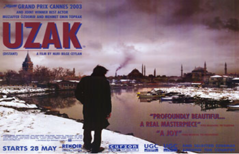
1) In the movie poster, I can see a solitary unknown man in a village that looks to be destructive or abandoned. Moreover, there can be seen a smoke coming out of nowhere which looks to be like a Factory. Additionally, the central image is facing towards the factory which could suggest his will to work there. But, the man looks rather weak and hurt which could suggest that he perhaps worked there and lost his job which is the reason why he is standing alone looking isolated. Moreover, the font of the title looks very strong and huge but the title has a shadow behind it suggesting how the movie could be about the man starting off great in life but then soon, his life starts to get miserable.

2) By looking at the movie poster, it looks as if it could be in a action genre due to the heavy fonts and the abandoned village maybe suggesting how there has been a war or something. However, it also looks to be a drama film because it looks as if this movie is only going to be focused on the mans life and his adventure. To conclude, i think that this movie can fit into the action genre as well as drama.

3) The target audience's age for this movie is going to vary from 15 to over 25 as it seems to be a movie about elderly life. Moreover, the poster looks quite terrifying which forces me to understand that only 15 and older are able to watch it.
From the central image, its a man which indicates how the main character is going to be a man. The main character being a man will attract more male than female. Approximately, I would state that 70% of the male will watch this and 30% of the female will watch it.

I'm not scared 

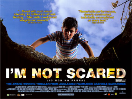
1) The iconography of a little young innocent looking boy looking down into a deep hole suggests how this movie could be about the boy falling into a deep hole. The title "I'm not scared" suggests how the boy fell into the deep hole and he luckily survived. Moreover, it signifies how the boy is fearless of what he saw and experienced in the deep hole.

2) This movie poster has denotations of what a typical horror movie poster would have. Firstly, the word in the title "scared" gives away a hint that it is going to be a horror movie. Moreover, the boy is looking down into deep dark hole; the fact that the hole is dark suggests what kind of creatures or spirits could be in there. Additionally, the font of the title looks huge to suggest how terrifying this movie is. To conclude, I think this movie is a horror genre movie due to the iconography of typical horror elements.

3) Even though the central image is a little kid, the movie still looks as if it should be for 12 years of age and older because of the horrifying deep hole, colour scheme and the fonts that make it look like a horror movie.
I think male are bound to watch this movie more than female because many males love to watch horror movies such as this. So, I would say that 65% male and 35% female due to the main character being a male.


Sin City 

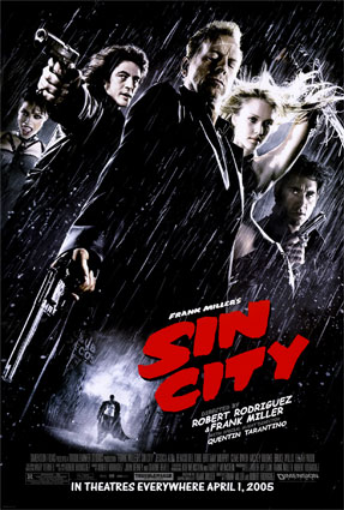
1) On the poster, the central image of a man that looks to be wearing smart clothes which forced to think that this movie might be something about a secret detective conflict. The shot of the central image is a low angle shot which suggests how the character could be the dominant one in the movie; the one that is the main character. The women and the men behind he main central image look as if they are all in a team also signifying how they always stick together. But however, the image of the alone fan on the bottom o the poster suggests how he doesn't need no one - signifies how strong and fearless he is. The colour of the title suggests how this movie is mainly going to be showing crime and action. To conclude, I think that this movie is about detectives that are in a war with other agents perhaps.

2) The genre i think this movie could be is an action genre as well as film noir and Femme Fatale. Firstly, i think this movie could be in the action genre because of the iconography of the guns and swords being held by the people which shows violence. Moreover, the colour "red" is a indication of blood and the fact that the title is coloured red could connote that the movie includes many violence and blood. Additionally, the colour scheme is mainly black which shows mystery within the movie which links with detectives. It also shows elegance within the characters and but also shows evil which forces me to understand that this movie might be in the action genre. However, I also think that this movie could be in film noir genre too as there are two women that look significantly lethal. With the low angle shot and the colour scheme, it forces me to think that women could be used to seduce or kill men in the movie.

3) With the movie poster looking as if it includes many action scenes and bloods, i think that the age of the target audience could be appropriate for people that are older than 18.
Though way more men are bound to watch action films, i think that 65% of men will watch this and 35% of women will watch this because of the main character being a male which will attract more men rather than women. However, there are also 2 women on the poster which will attract a little more women.

Image result for pirates of the caribbean dead man's chest
Pirates of the Caribbean

1) The title shows that the movie will be about pirates that perhaps fight to stay alive as we can see destruction of ships on the poster. This could also suggest that there is a conflict between pirates. The title "Dead man's chest" could suggest how the main characters are probably on the hunt for the man that killed someone perhaps. Jack Sparrow looks to be the most fearless and lethal character in the movie through his grin which shows his lack of hesitance and fear when being in a fight perhaps. From this, i can infer that Jack Sparrow could be the pirate that is the main character and is there to protect and save innocent people's lives from the wicked one.

2) From the poster, i can say that this movie could be in a action genre because of the destruction image shown on the picture of the ships floating down. It makes it look rough. Moreover, the skull in between the title show how the movie will contain a lot of action scenes. Skulls are indication of danger and death. However, i also think that this movie is an adventure movie as i think that the title "Dead man's chest" suggests how they could be on an adventure to find the killer of a man perhaps.

3) I think that people that are aged over 18 are most appropriate and are bound to watch this movie as it looks like it includes a lot of violence and blood. Moreover, there is a woman which is quite unusual as we don't see women in many violent movies but her presence shows how there could be inappropriate scenes between her and the man in the middle which makes the target audience to be a older audience.
I would state that more men are bound to watch this movie just because of the deadly iconography on the poster. Perhaps, 70% male and 30% female, female won't really take interest in watching violence and blood.


Bride and Prejudice 

1) On this movie poster, the iconography of a man and a woman together could signify how this movie could be about their love story. Moreover, in the background, people look as if they are celebrating which could suggest how they were destined to be together perhaps. Moreover, it could also connote that they could be having a wedding since their love is too much. Additionally, the comment on the top gives away the plot of the movie on how its going to be a love parody movie.

2) The genre of the movie is certainly given away on the poster where it says "spectacular, romantic, funny and so sexy". This signifies how the genre of the movie is going to be a romantic comedy movie. Moreover, the font of the title looks quite funny as it isn't lined up properly which has a synergy with the comedy genre. Additionally, with the man and the woman standing next to each other, it could suggest that they have feelings for each other which forces the movie to be in the romantic genre too.

3) I think the genre for this movie would be U because i think that it's appropriate for many to watch as it looks as if it doesn't include any violent content.
Moreover, the gender wise is going to be more women to watch this movie as romantic films are mainly appealed by women. I would say that 65% women and 35% men that will watch these kind of movies.

Million Dollar Baby 

1) The woman as the central image looks to be dressed as a sport athlete which could signify how this movie could be about her and her sport career. She looks to be strong and fearless as her whole body is facing the other way forcing the viewer to understand the danger she is capable of creating. She is covered in white and black colour which could suggest how her personality is. Moreover, it could also suggest how strong she is. There are 2 men in the background and one of them could be her coach or trainer whereas the other could be her boyfriend.They both look agitated and miserable which could suggest how they don't want her to be doing what she is doing. Furthermore, her back looks masculine which supports the idea of how she likes to fight or exercise perhaps.

2) The fact that she looks masculine could suggest that she loves to exercise or fight. The genre looks to be action although it may also be a sport action movie. This is evident through the clothe that shes wearing, her masculinity and her pose; many boxers or ufc fighters pose like that. Through her masculinity, there must be action scenes within the movie. Further justification, she looks rather angry.

3) The target audience age for this movie could be 15 and older as there will be fights and bloods shown in the movie.
The gender separation would be that more percentage of men will still watch this movie even though, the main character looks to be a woman. Men are just more into fighting and action and that is what they love to watch and be entertained by as well.


Photoshoot

1) Which of your main characters will appear on the front cover of your programme? The main character who is Natalie played by Sophie will...